


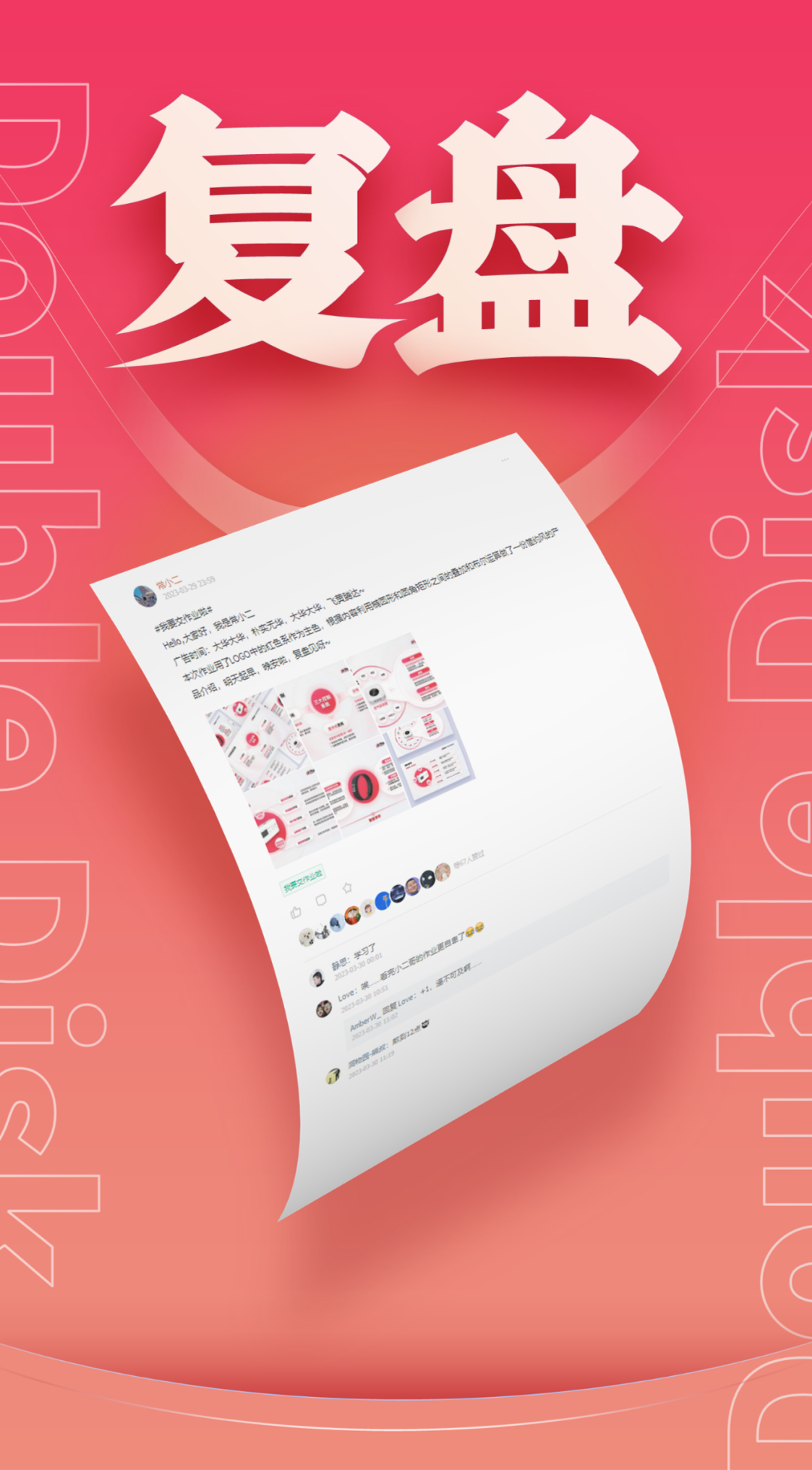
Hello,大家好,见字如面,我是常小二。
今天为大家分享的是关于科技互联网行业的一份产品介绍PPT,下面就把本次作品进行拆解和复盘,分享关于作品的设计思路。
进入正题
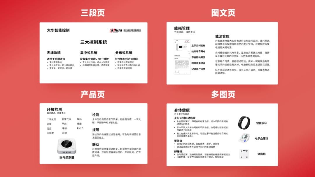
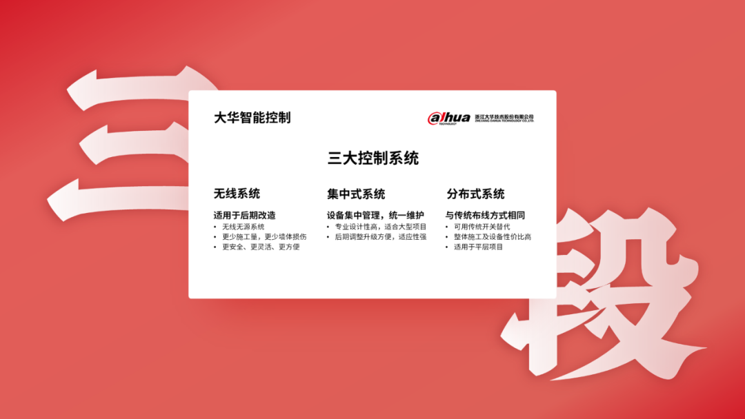
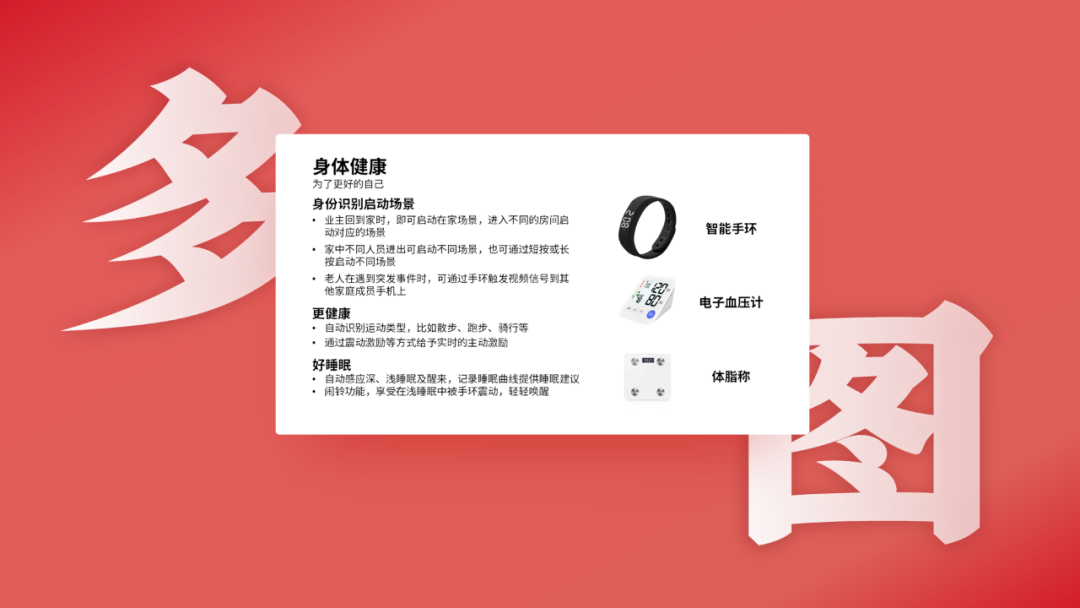
以下四页原稿,内容涵盖了三段页、图文页、产品页、以及多图页的四种排版,也属于产品介绍中的典型页面。

了解一个品牌,可以从官方渠道中去寻找灵感,总能收获到很多值得参考的点,比如品牌色系,配图风格等等,先尝试熟悉下品牌的内容才能更好的建立规范。
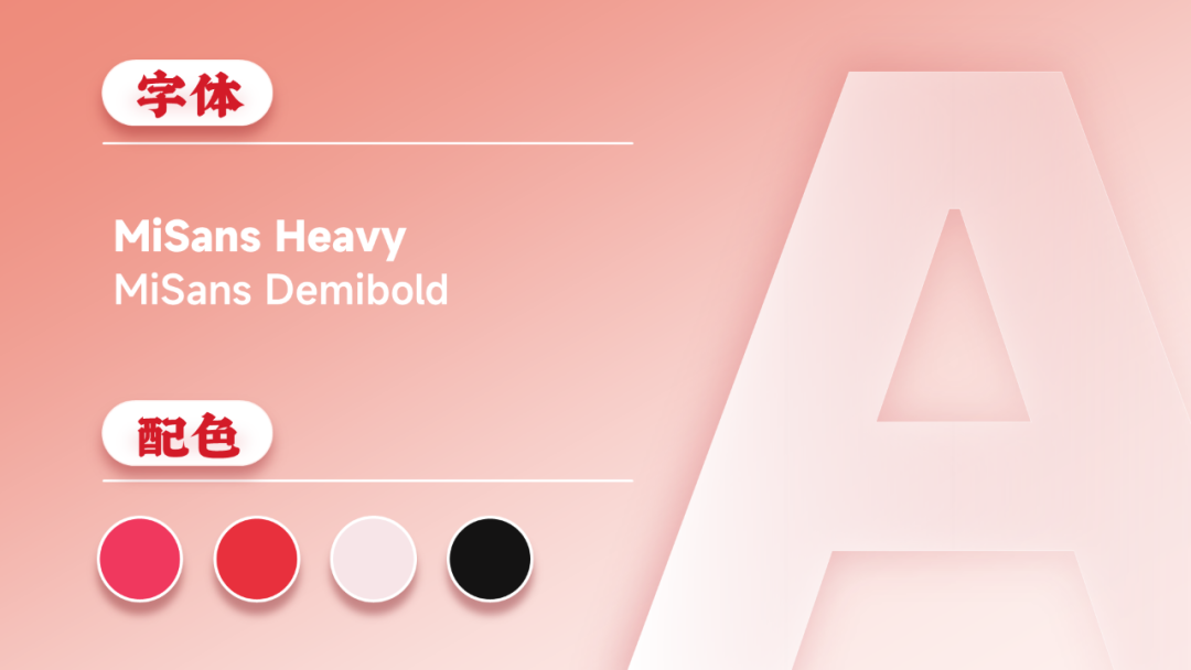
字体方面,选择了MiSans系列字体作为标题和内页描述文字介绍使用。
接下来,我们一页一页来还原制作过程。

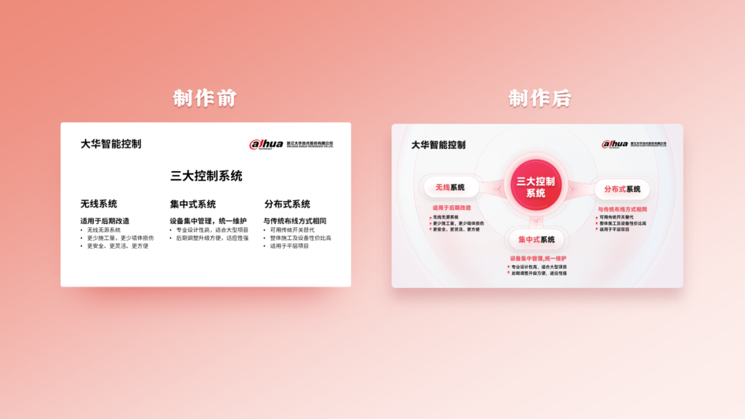
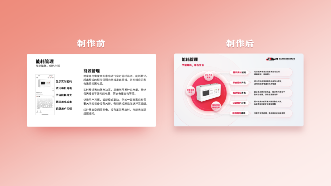
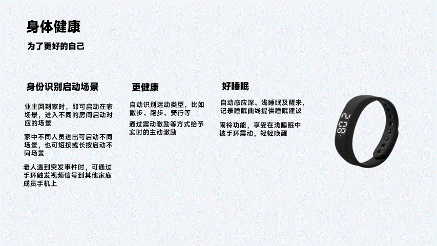
内容常见的,有一段、三段、四段内容的,一方面需要对内容版块做信息提炼,另一方面需要做风格延伸。
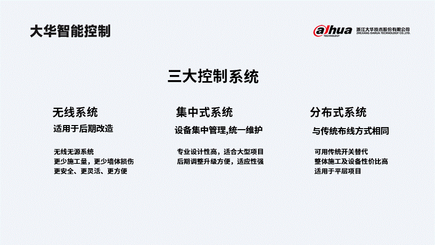
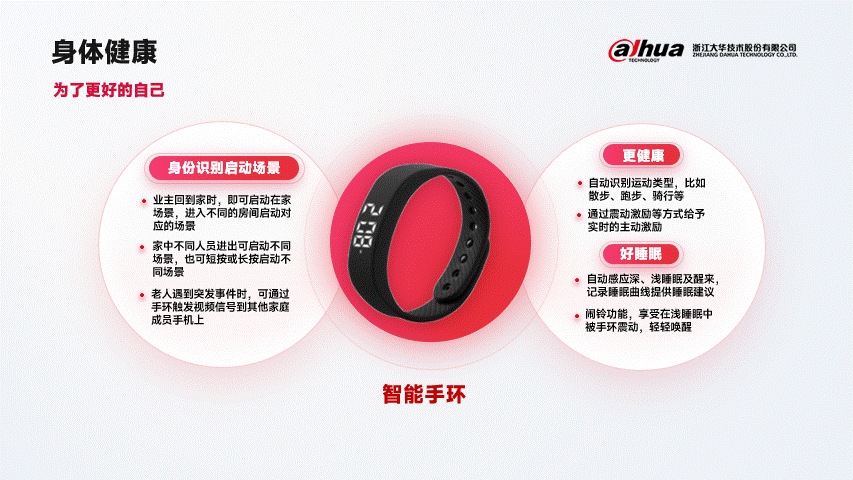
第一步:将原稿文字更换为设计规范字体,通过对重点信息局部换色来形成对比,突出内容。
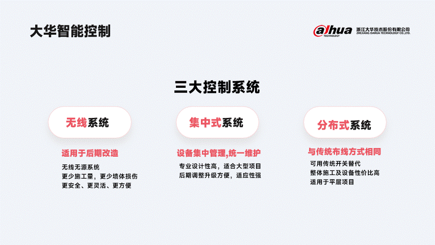
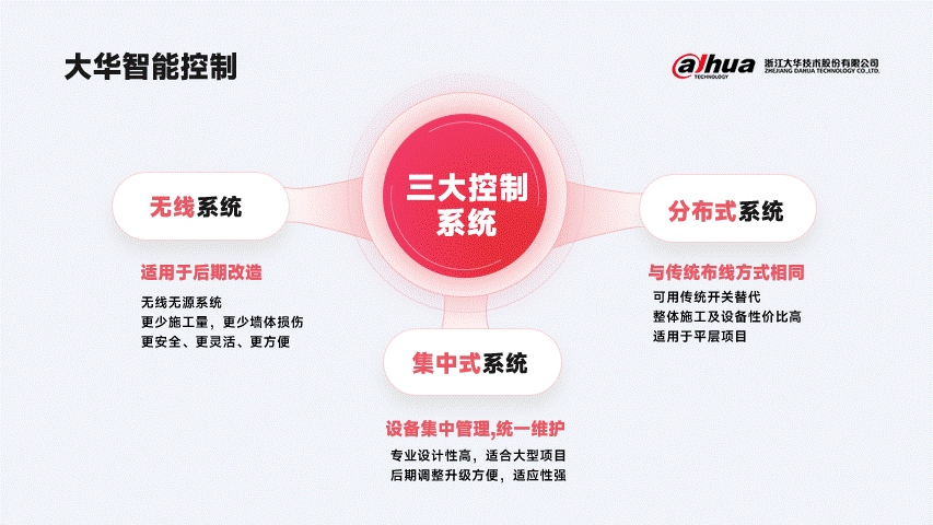
第二步:版式太过单一,那么可插入一个渐变椭圆形来聚焦主题,并将三个版块内容进行上下布局排版。
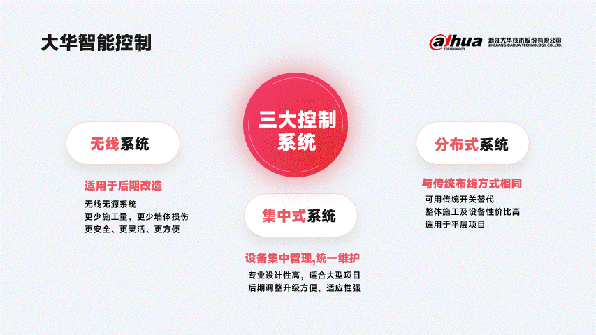
第三步:三个版块内容与标题缺少连接,那么可做一个带有弧度的自定义形状来作为连接点,将三者联系起来。
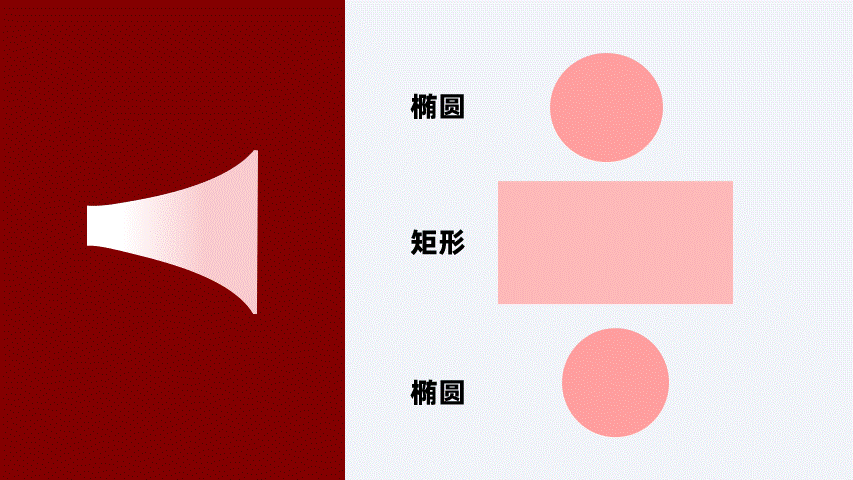
自定义形状的步骤:
01.如下图,插入2个相同大小的椭圆,1个矩形
02.将椭圆变形放大,如图放在矩形的上面
03.选中三个形状,形状格式-合并形状-剪除
第四步:如果觉得画面太平了,缺少设计感,那么可插入形状空心圆设置渐变置于底层,来营造氛围,突出主体,搞定。
三段页终稿:
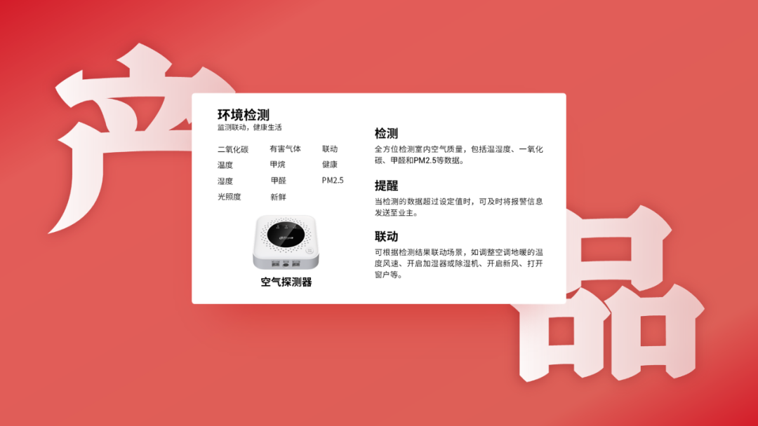
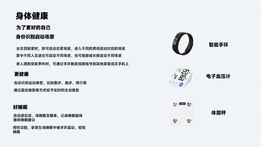
图文页排版也属于常规页面之一,一般页面中有单张或多张图片配合单段或多段文字叙述。
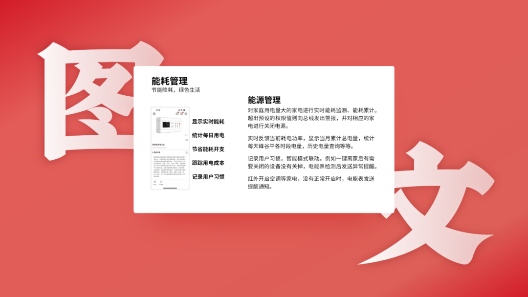
第一步:梳理原稿内容,通过抠图保留重要产品信息,加入形状作为文字容器,让内容之间更加清晰明了。
第二步:左侧产品太过单调,可尝试加入一个渐变圆形来进行突出产品。
第三步:最后我们可以再叠加一些圆形和空心圆来修饰,搞定。
图文页终稿:

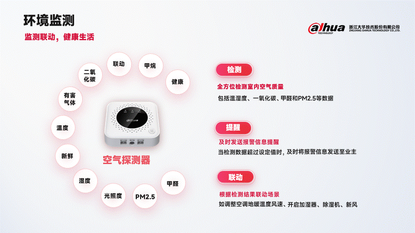
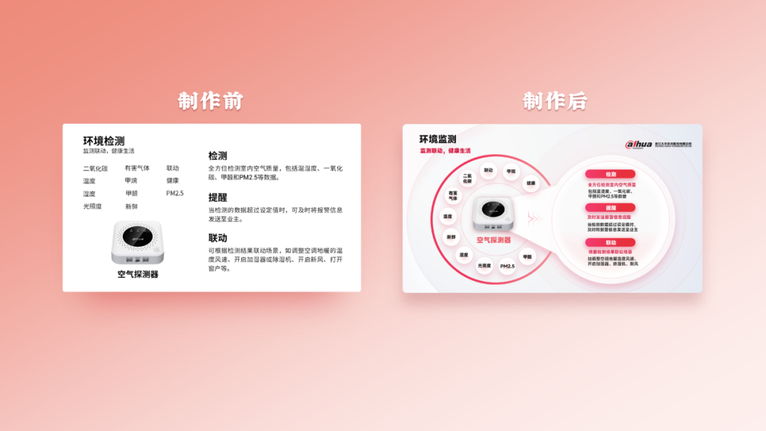
产品页也是排版中经常遇到的一种类型,往往一个页面会放1张、6张,甚至10张产品图片。
第一步:阅读原稿内容,文字内容上已经很简洁了,无需过多的提炼,那么我们就可以用到形状去修饰内容。
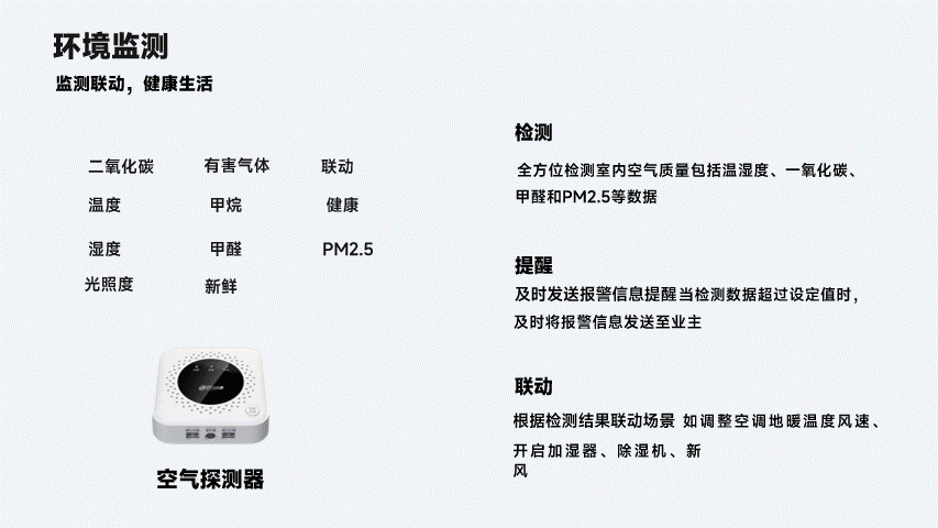
第二步:将产品的11个关键特征排列成圆环形,与产品建立关联性。
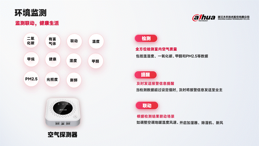
第三步:加入弧形线条,以及自定义形状来强调内容之间的延伸关系。
自定义形状步骤:
第四步:最后在画面中叠加1.2层圆形形状置于底层作为背景来让整体更有层次感。
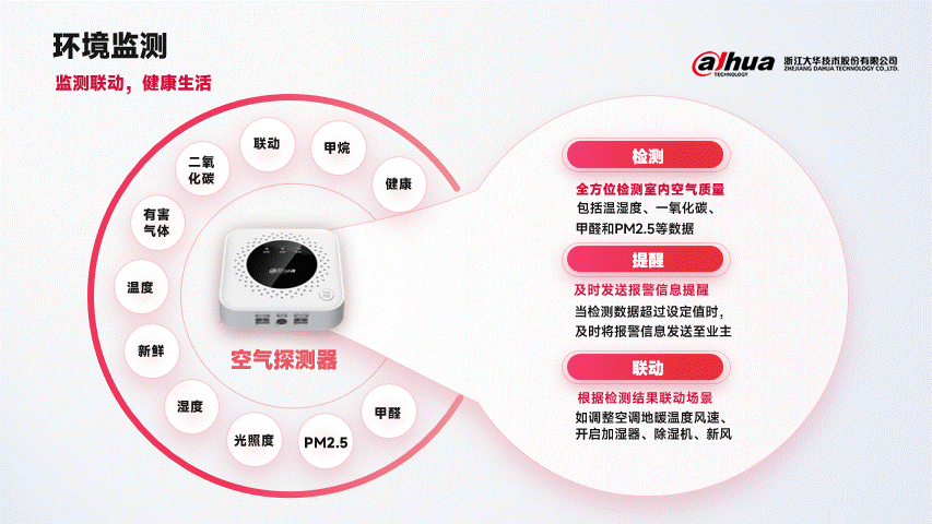
产品页终稿:

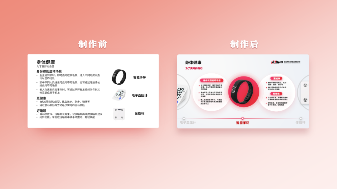
多图排版也是排版中经常遇到的一种类型,往往一个页面会放3张、6张,甚至10张图片。
第一步:阅读内容,得知3组内容都是在讲智能手环,那么可暂时将其他2个产品图放在画面外待美化。
第二步:同样,延续风格,加入圆形,让产品与内容之间产生联系。
第三步:最后,我们可通过在页面下部插入一根直线并标记好产品名称,并在左右两侧加入其他2个产品的局部图片,因为目前的内容主要是针对智能手环,搞定。
多图页终稿:
以下为四个页面的最终设计图:


111