


类型:培训课件
页面:封面页、荣誉页、目录/过渡页、关键词页
风格:商务风
构思:
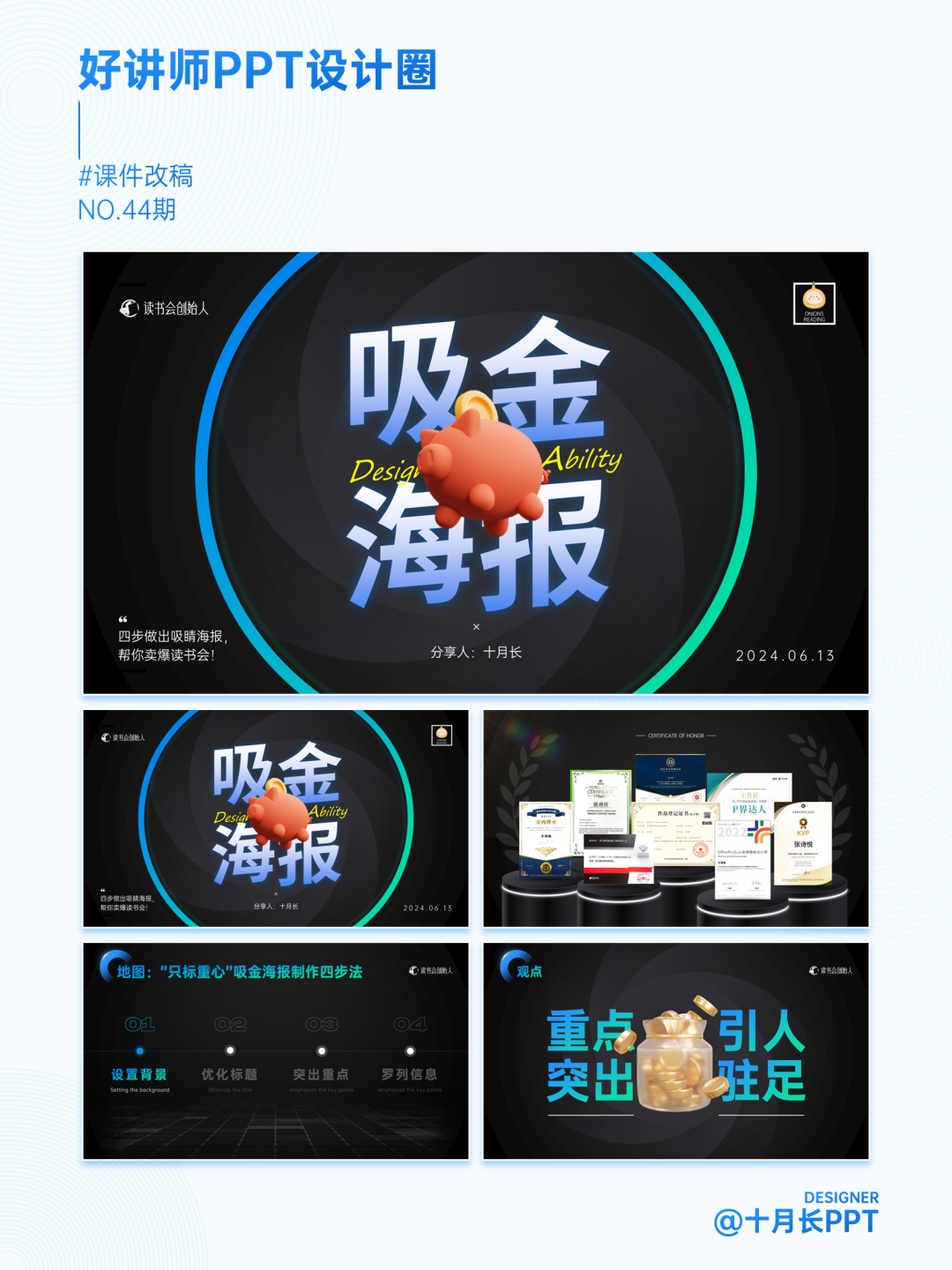
本周四受邀到彭小六老师的【读书会创始人】社群分享——读书会招生海报的设计技巧。本周改稿我从课件中选取了几张关键页面分享给大家,时间紧任务重我们怎么快速完成一堂小课的技巧都在里面了。
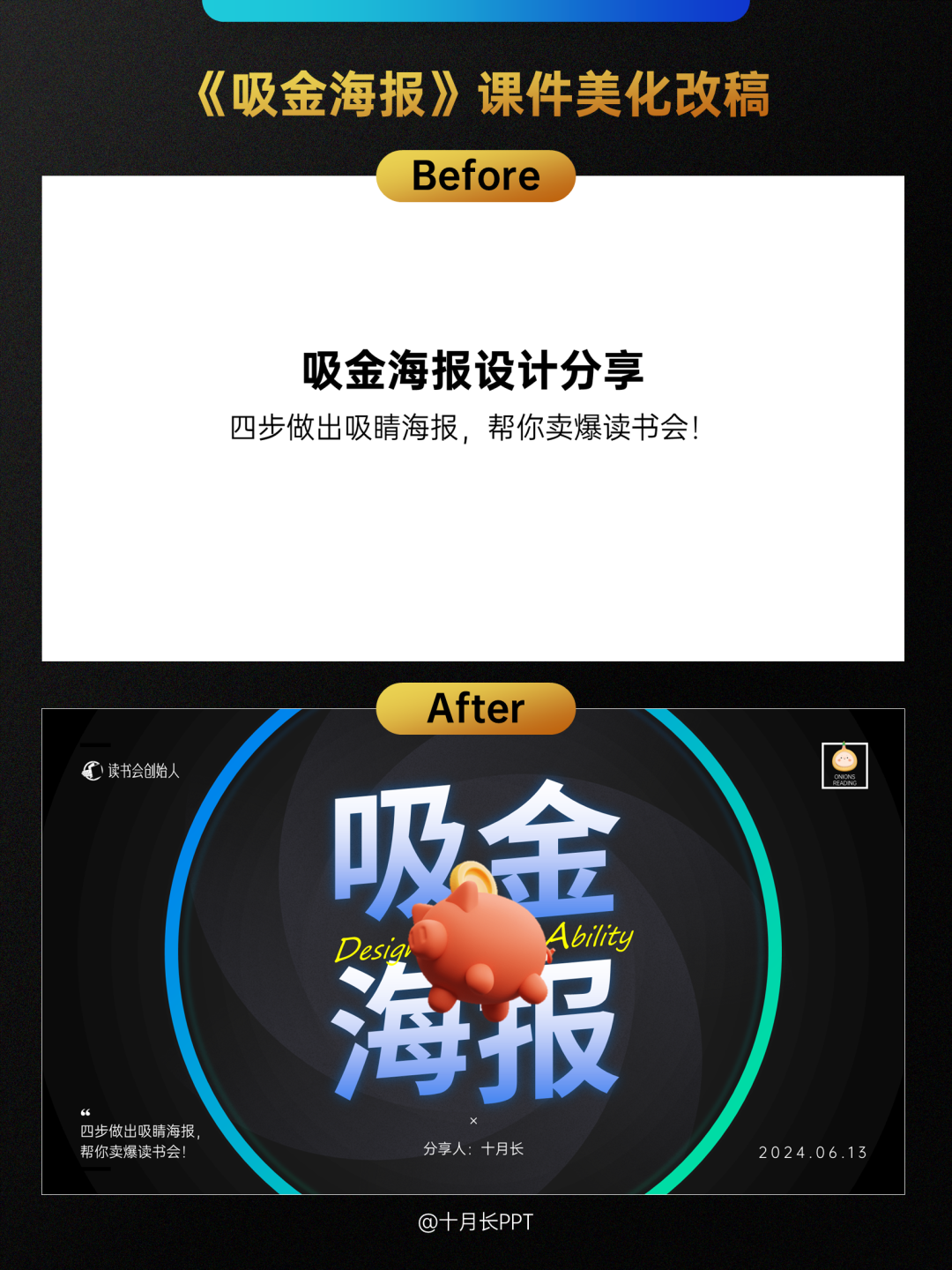
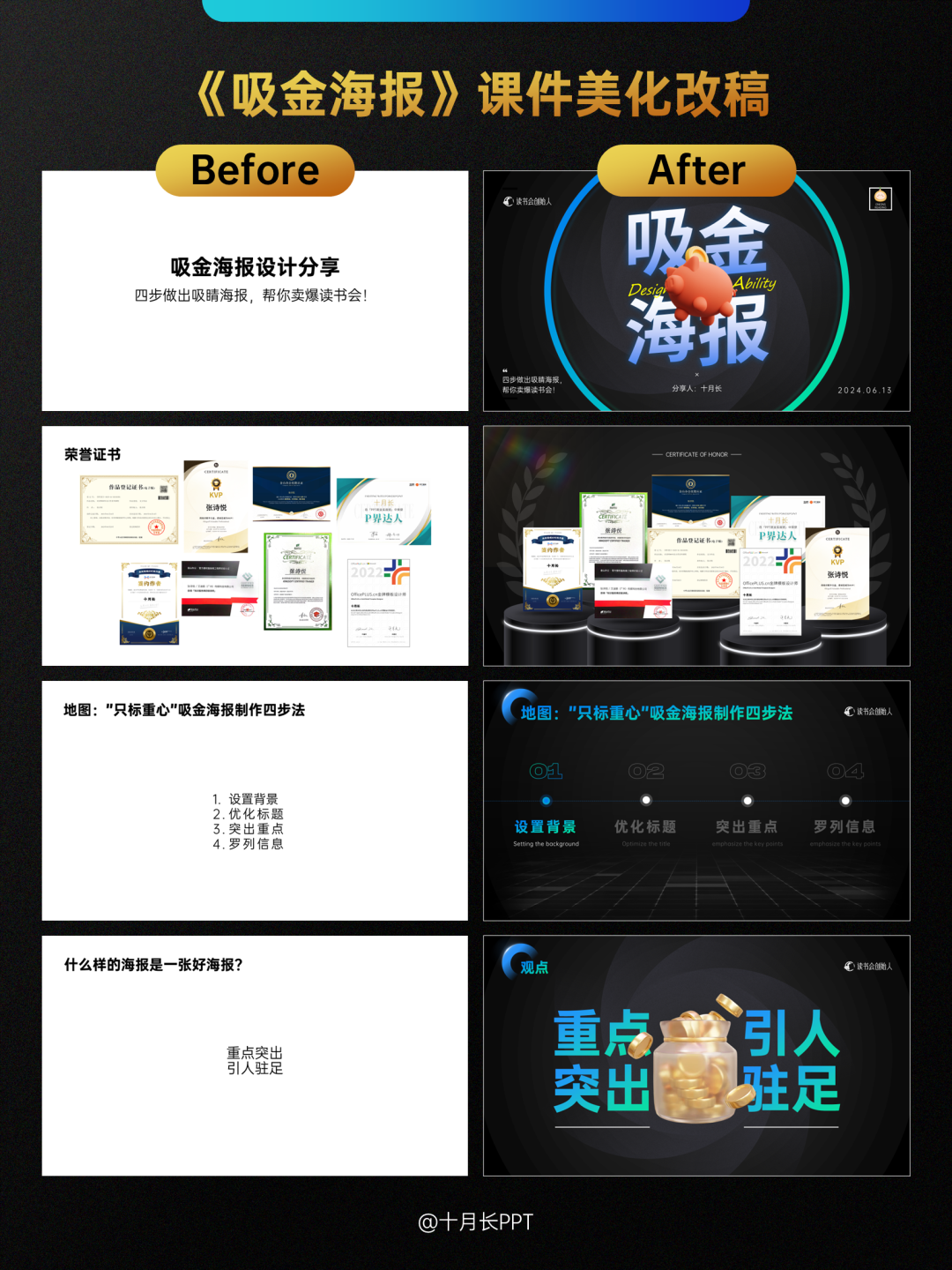
1.【封面页】想要聚焦分享标题,先把“吸金海报”四个字以田字格样式放在中间,其余文案,图片,如读书会创始人的LOGO、分享时间、副标题压四角摆放到四周;
中间再加入小字号手写英文字体,以及点题的小猪存钱罐叠压做层次;
最后找了一个像花朵一样徐徐旋转绽放的图片置于底层,再用一个圆环框住主题区域,模拟像鱼眼镜头拍摄的场景,一张简单但有质感的封面页就完成了。
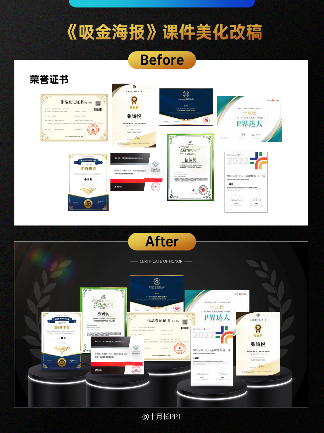
2.【荣誉页】很多老师讲课开场介绍自己,除了清单式罗列标签,还可以把自己获得的荣誉证书都放出来压场子,效果十分震感。
不要平平无奇的排列,而是插入台子素材,营造场景感和画面的空间感。
还可以加上麦穗,成功喜庆的氛围一下就有了;最后,如果是深色背景,还可以加上一抹光晕,就像这次画面左上角的一样,高级感拉满。
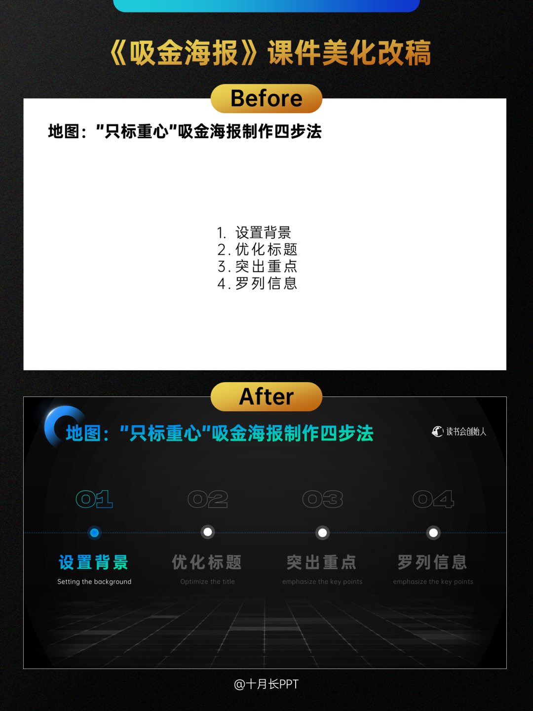
3.【目录页/过渡页】根据章节的明暗变化,我们可以清楚get到现在讲到第几章了,所以这一页既可以是目录页,也可以是逐渐点亮的过渡页。
设计上,无非是加了一个像地面一样,有纵深感的网格素材,给人一种新知识新世界的大门已打开,欢迎你来的感觉,画面也一下有了空间感。
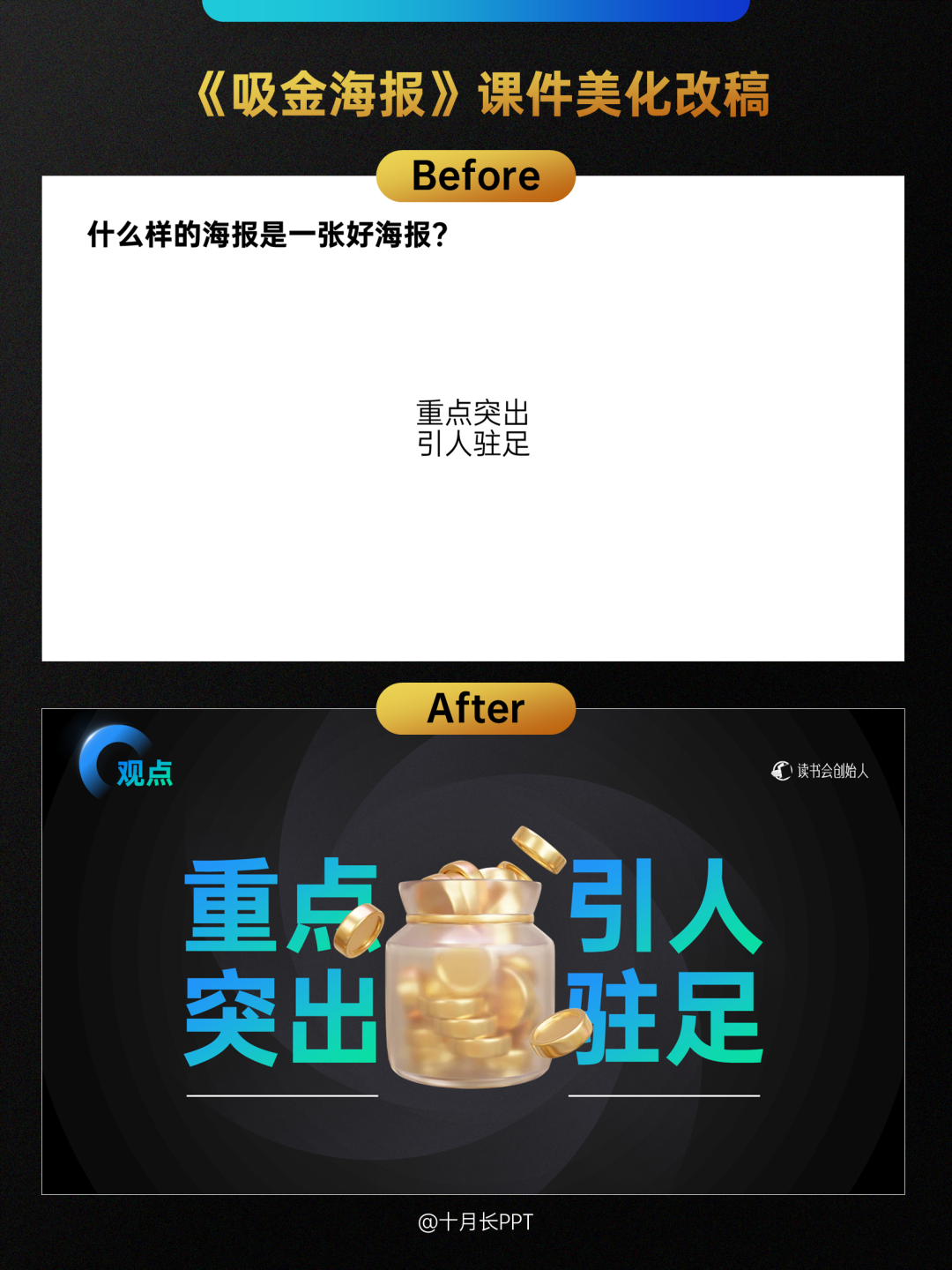
4.【关键词页】这一页实际分享中被我拆成了2页,先是单独的问题,抛出问题,引出学员的思考,等和大家互动完,再给出自己的观点,毕竟咱们的使用场景是课件,不是平面设计,不用非得放到一张里,你说对吗?
字少的关键词页,其实只要把字放大放大再放大,然后插入一个配图做叠压,简单大方,重点突出就可以了。
声明:本站所有文章,如无特殊说明或标注,均为本站原创发布。PPT世界内网友所发表的所有内容及言论仅代表其本人,并不反映任何PPT世界之意见及观点。如若本站内容侵犯了原著者的合法权益,可联系我们进行处理。


👍👍👍👍👍