


嗨,大家好,我是愚人。
最近有很多朋友和客户向我留言,想要看医疗、医护风的PPT怎么做,最好是那种看起来没那么张扬,但还是能体现出「爱心」、「关怀」、「健康」的感觉,有独特的小细节。
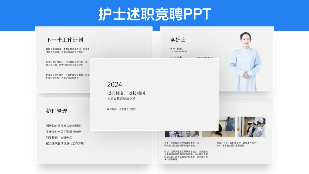
作为一个给多家医院、多位护士长优化过PPT的专业选手,这自然难不倒我,来!有请今天的PPT原稿,一份护士的述职竞聘汇报:
(内容经过脱敏)
有个人介绍、有成果、有案例、有计划。很通用,我来逐页与你分享设计思路和过程。相信你看完一定有收获!
01.PPT封面
怎么简约而不简单?
—
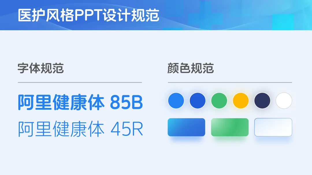
首先,我为客户制定了一个字体和颜色的大概规范,比如,既然是医护主题,那么圆润且免版权的阿里巴巴健康体,就是一个不错的选择,颜色上,蓝色最为通用,绿色、黄色等可以作为点缀:
有了设计规范,首先改变封面文字的大小,在汇报场合,如果你想显得谦逊,那可以选择左对齐,右侧的空白可以用一张图片填补:

聪明的你一定猜到下一步了,把图片放大至全屏,然后添加一个蓝色的蒙版,凸显文字:

这样,只是做到了简约而简单,为了让客户的PPT视觉效果更丰富,我在背景中加入了一些线条、光纤、医疗的图案,颜色也更加丰富了:

最终,得到了这样的凸显「爱心」、「关怀」的PPT封面:

也可以将右侧的图片换成一个盾牌,强化「守护」的概念,你更喜欢哪一个呢?

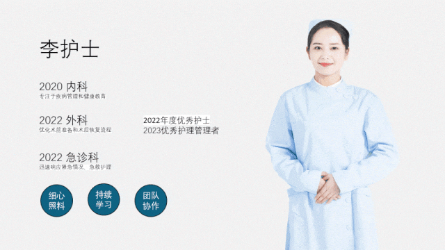
02.个人介绍
怎么凸显出独特优势?
—
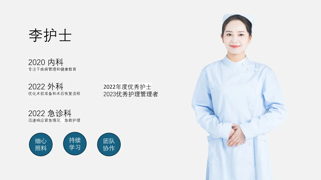
工作经历+个人荣誉+个人标签,非常全面的个人介绍,如何让这三者和谐统一呢?
我们可以将三个标签围绕在人物周围,然后将两个奖项置于画面最中间的位置,下方放置工作经历:
如果想突出经历,那么可以在人物照片上层添加一个衬底:
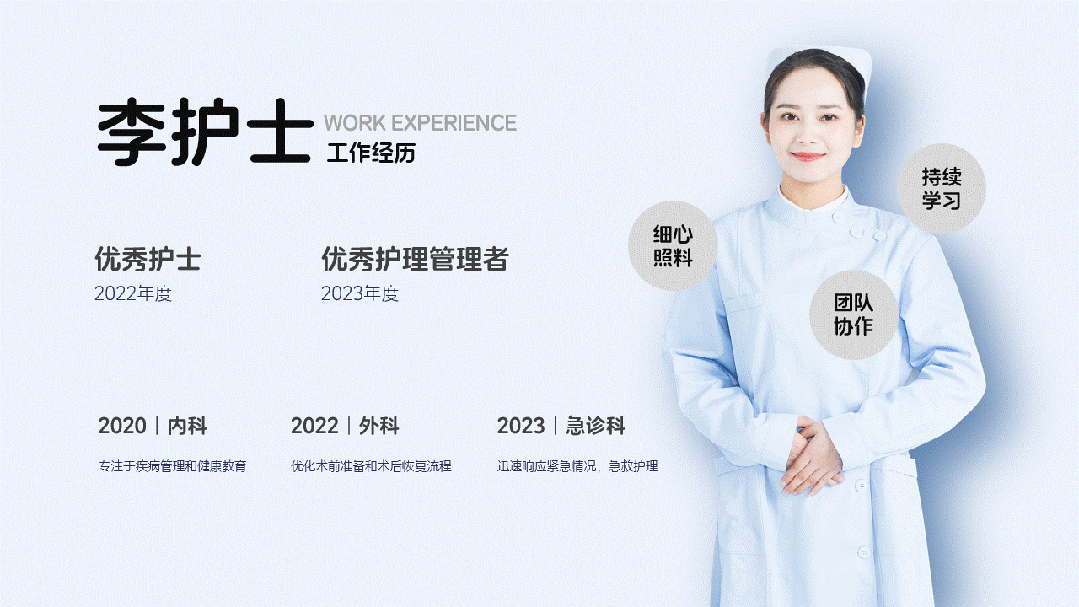
套用颜色规范,就能得到一页简洁的个人介绍:
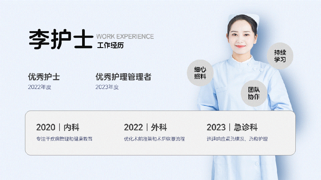
如果觉得单调,可以在人物的背后加入一个圆形,不只是画面更丰富,也可以让观众的视线更加聚焦在右侧的个人优势上:

03.工作描述
怎么排版才舒服?
—
对于这样较为常规的工作内容描述,可以使用居中对齐,左右排版:
没有可以突出的文字,那就使用好看的图案进行代替:
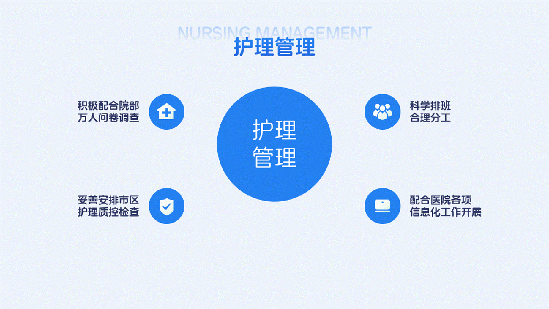
最后,加入一些细节,让画面更耐看:

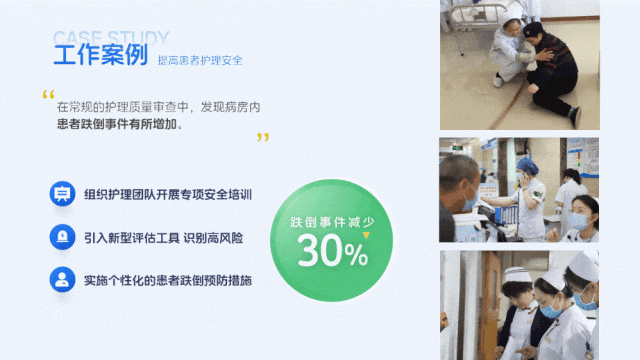
04.工作案例
怎么一眼让人Get成绩?
—
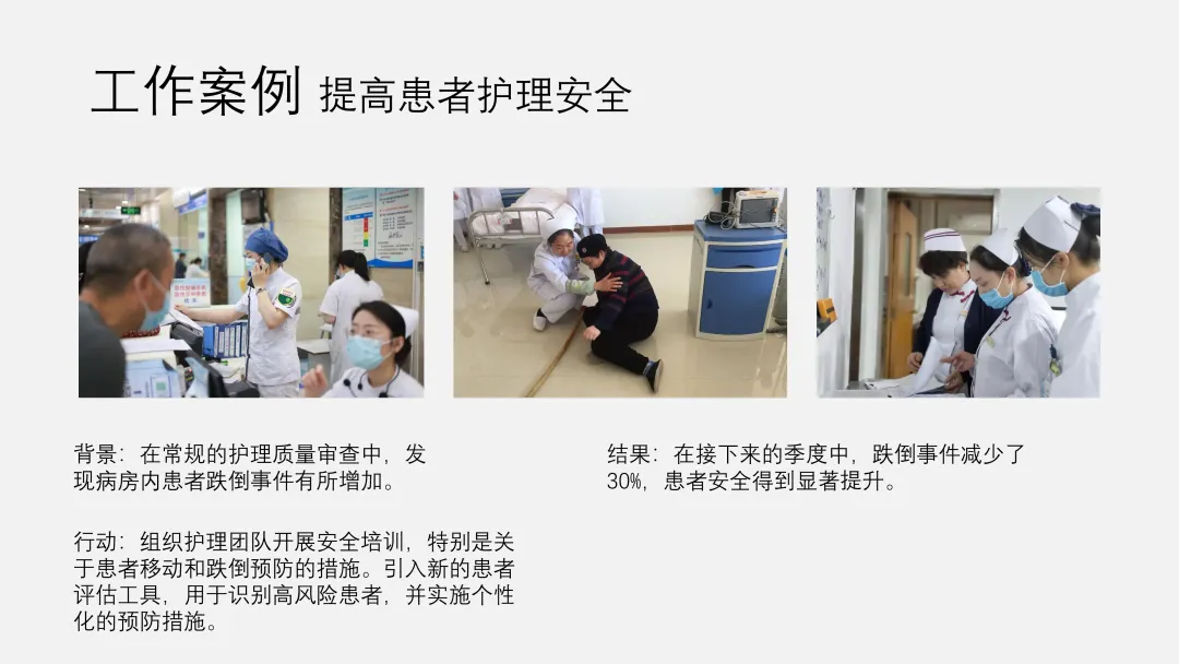
工作案例分为三部分:背景+行动+结果。
最重要的是什么呢?没错,是结果,其次是行动,那么首先要做的就是将大段文字做简单梳理,并且强化数据。
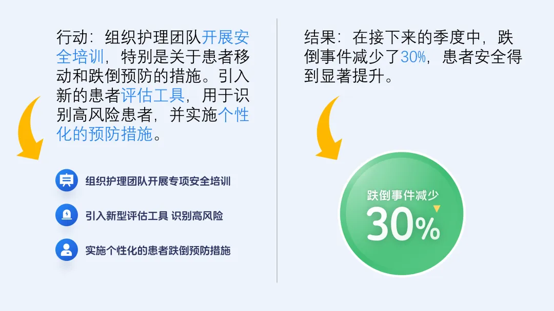
这样,即使没有做其他设计,也能让观众一眼知道什么是重点:
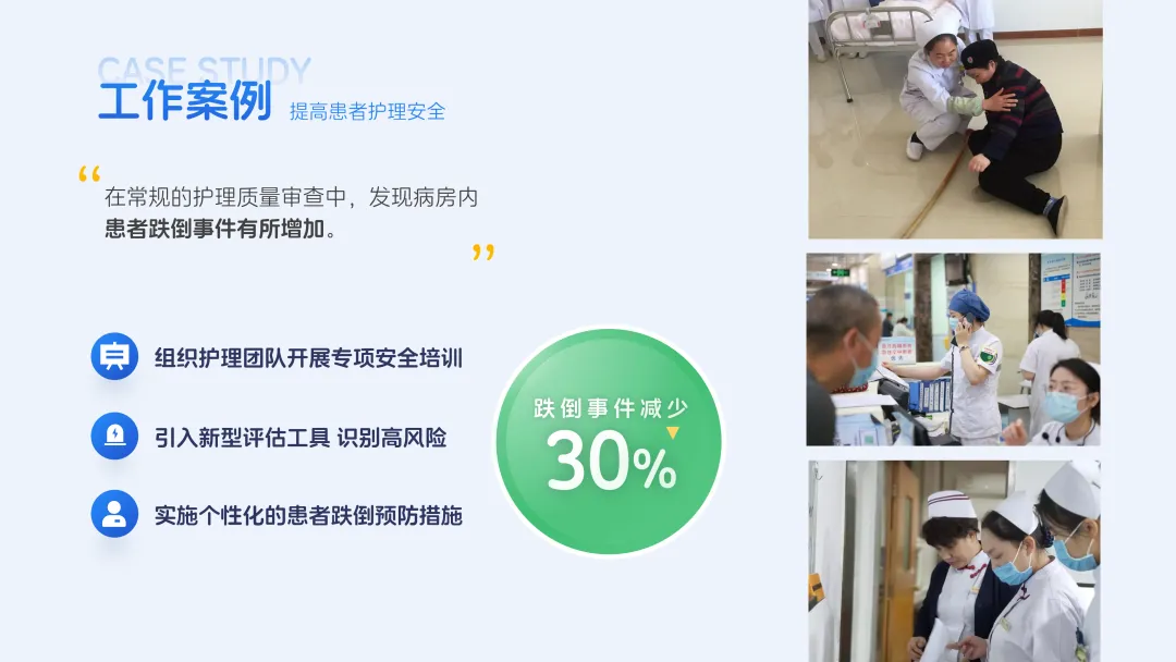
加入一点点细节,比如在左侧插入一个大衬底,右侧的图片做一些错落排版,一页案例展示就完成了:
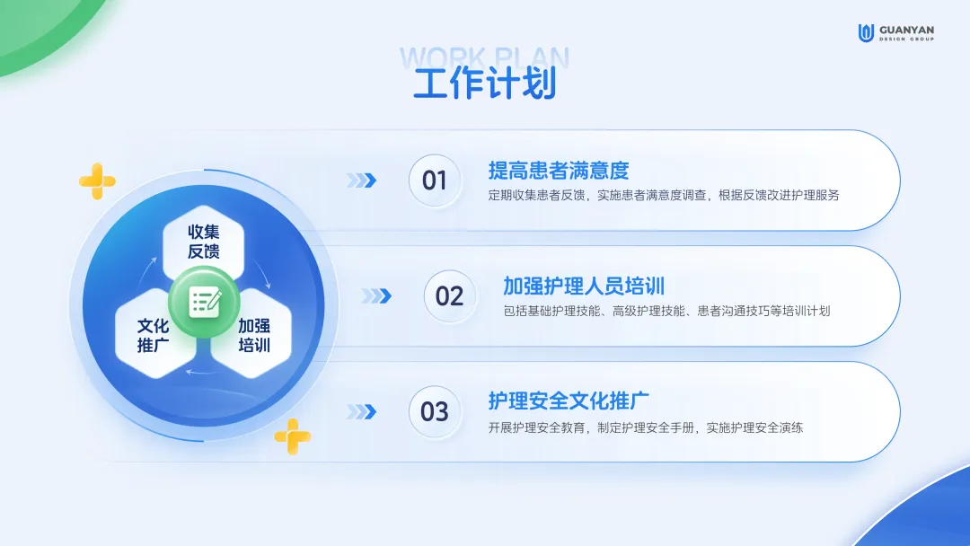
05.工作计划
怎么突出重点?
—
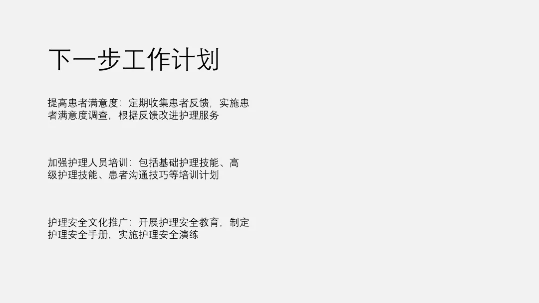
遇到大段的文字,我们首先做提炼,将标题和正文区分开:
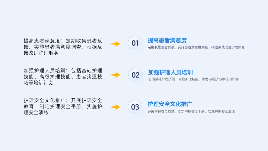
也可以进一步思考,如果每段话只能保留一个关键词,应该是什么?是收集反馈、加强培训、文化推广。围绕三个关键词,就能得到一个新的设计元素,而且是定制化的:
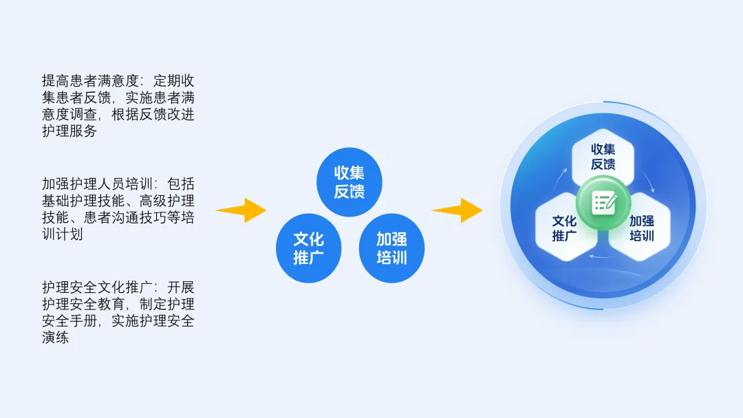
将二者做个组合,既有简洁突出的关键词,又有详细展开的说明,兼顾了演讲和阅读:
总结如何做出一份低调又用心的医护PPT?


666